A rebrand
-
To design a completely new brand for a top-quality English Sparkling Wine with original labelling and branding which were underperforming with the target market. The client expressed a desire to create a more refined brand, befitting the quality of the product, for the 40+ demographic in the UK & Ireland.
-
The client brought to the table the name Carriage, and wished for the brand to built around that. They also expressed a desire for the brand to include scope for the building of a collection of premium food & beverage items.
-
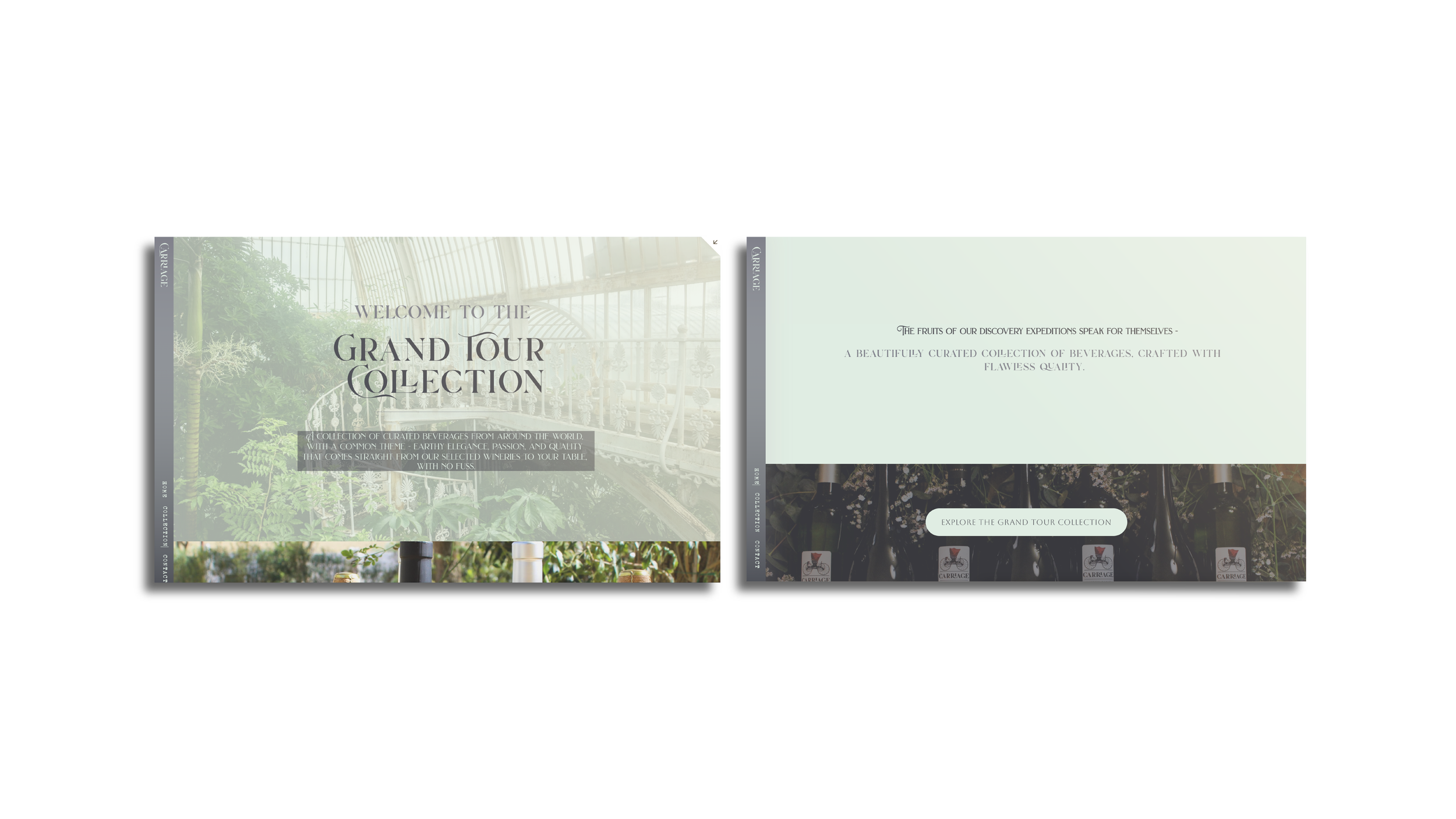
Around the word Carriage was built a brand image and tone of traditional elegance, meeting the simplicity of modern clean lines and colour palettes. The concept of the Grand Tour Collection was also born, drawing from the history of the aristocracy making their “Grand Tours” of the world .
Carriage would make its own Grand Tour, with the sole purpose of tirelessly seeking out the finest goods from the four corners of the globe.
-
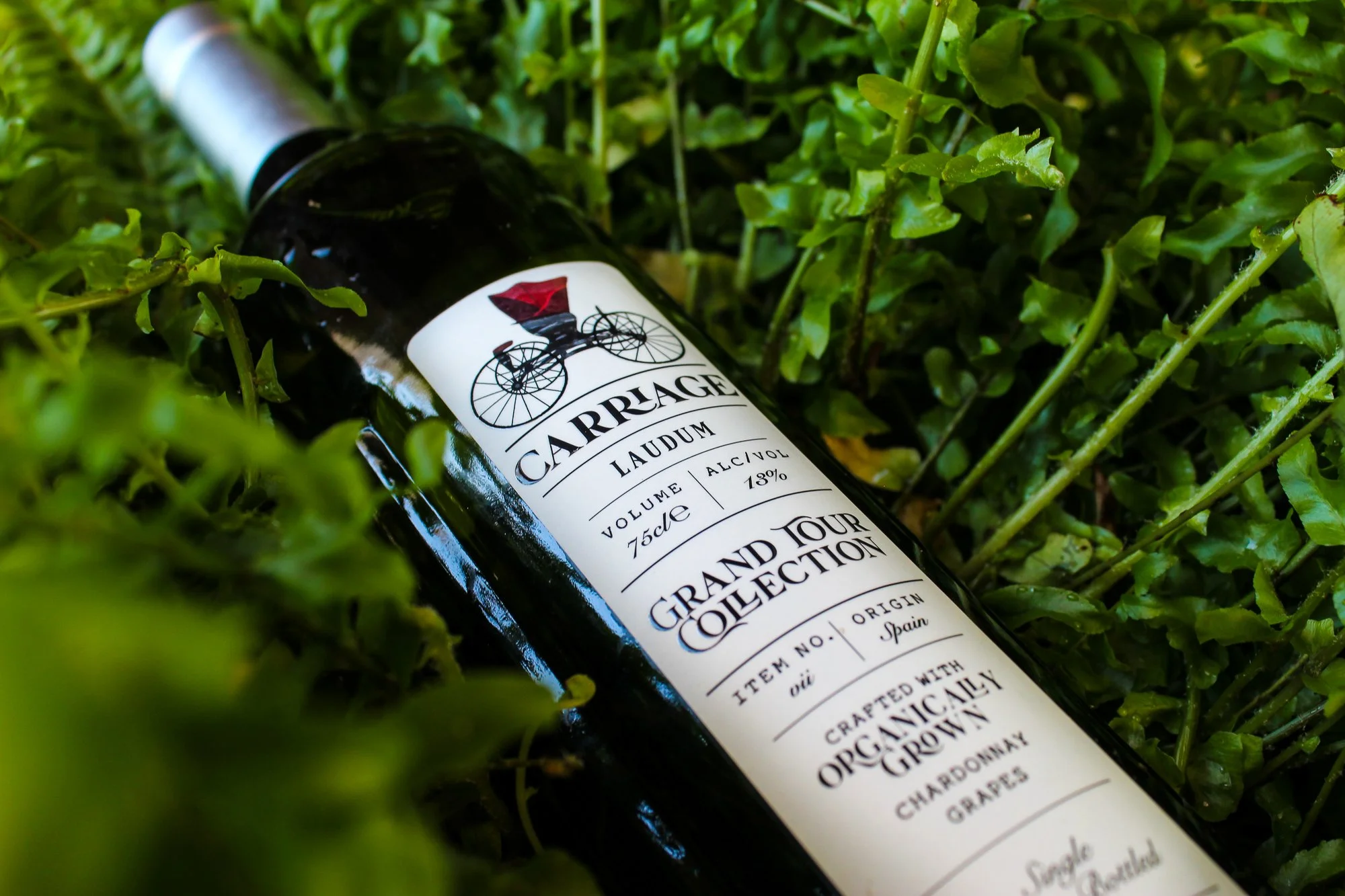
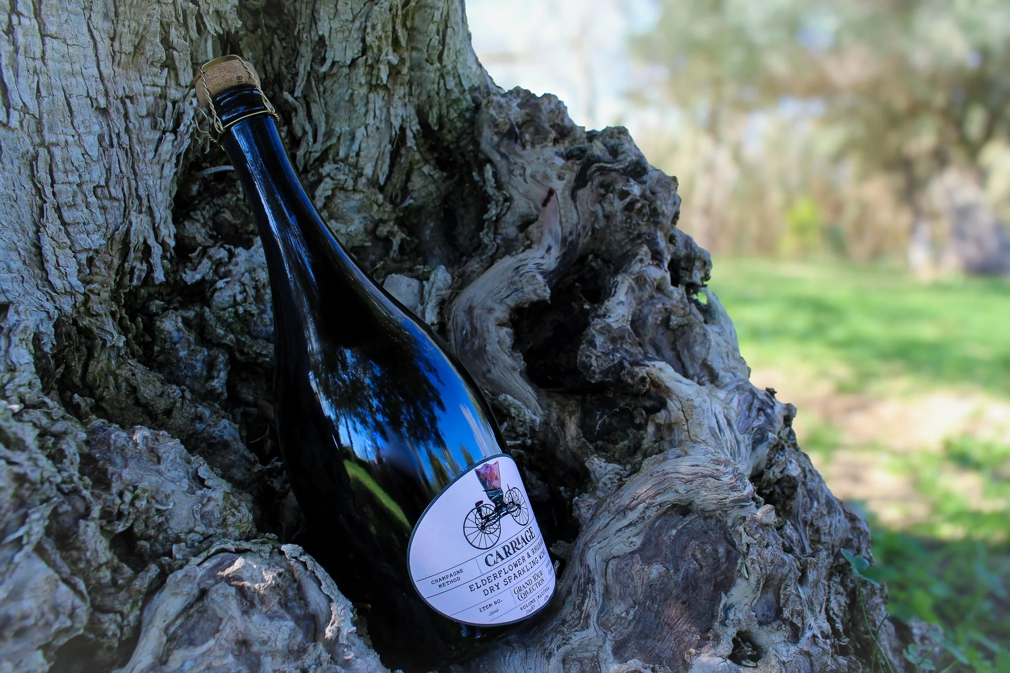
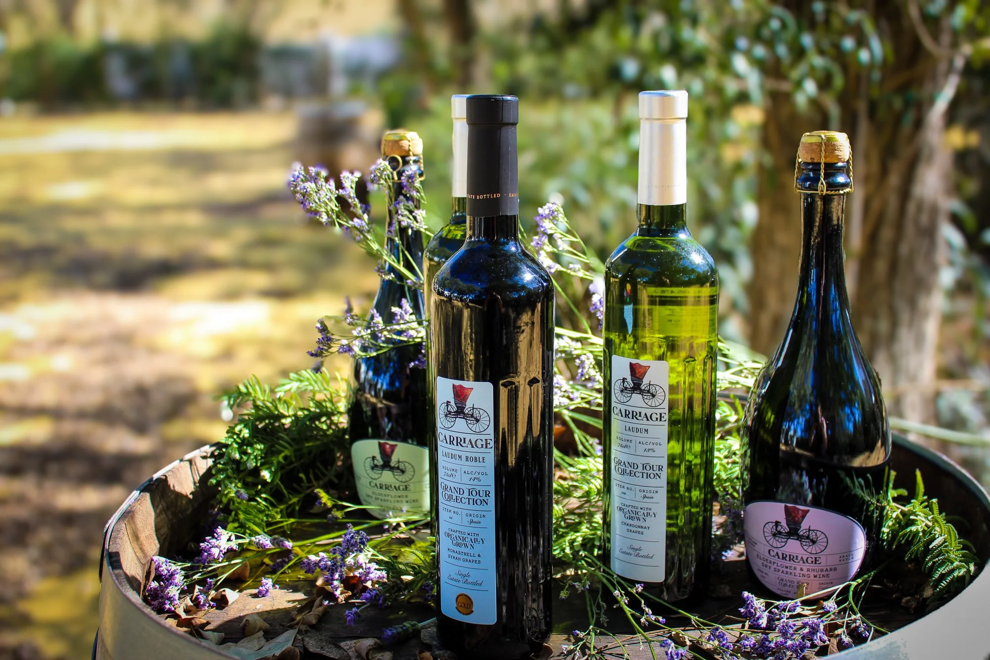
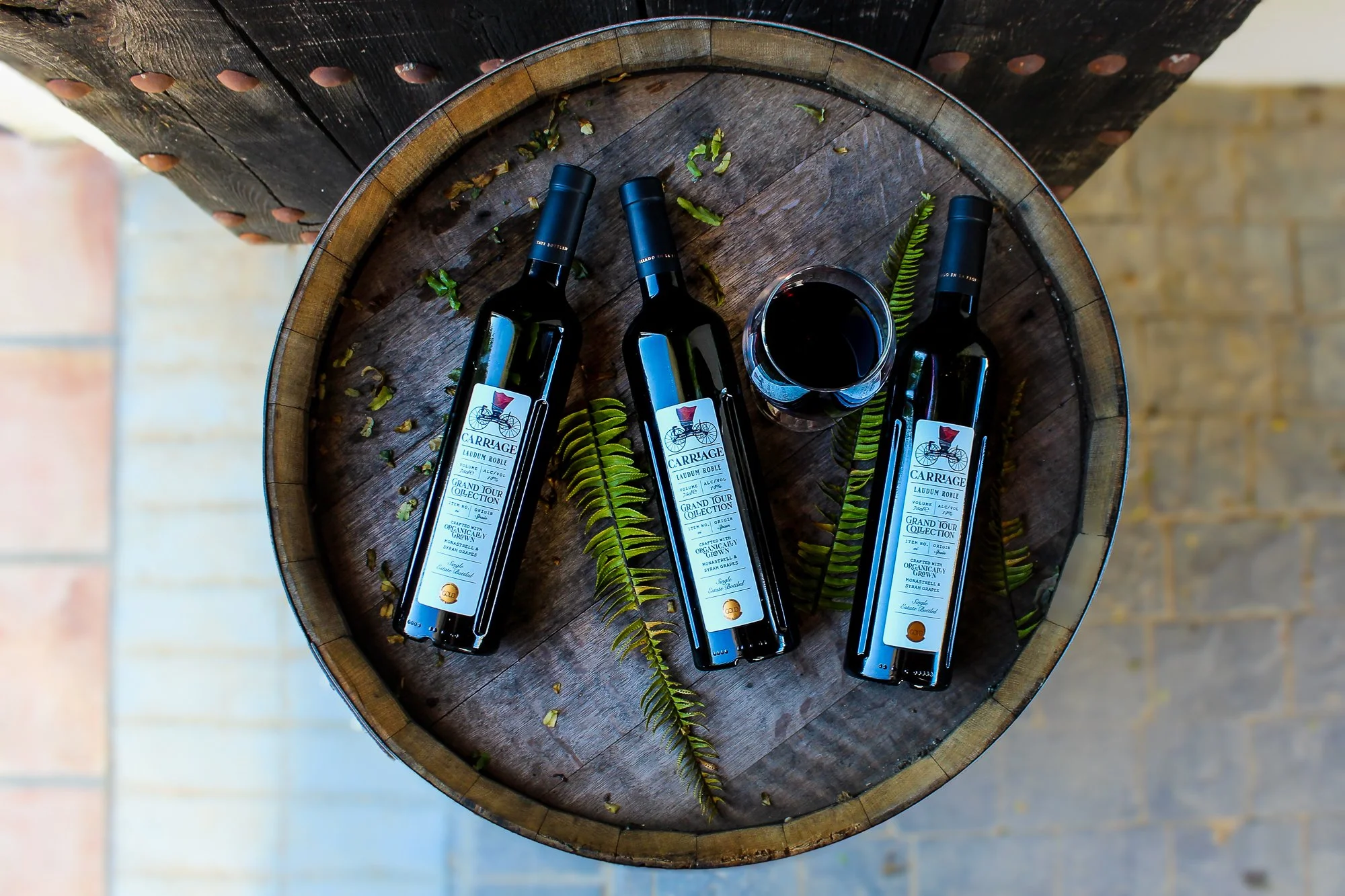
A suite of labels were designed for an initial 4 product S.K.U.’s. While modern clean lines, soft colours and ample spacing were used to give a fresh feel - the carriage illustration and font selection draw to mind a sense of familiarity and trust , normally associated with a brand which has been around for a while.
-
Preliminary development of web prototype has been carried out, with phase 2 underway.
The preliminary product photography below was also carried out by Clarity.Creative.